My visual CV
TLDR; I made a visual timeline of my career (CV) completely in R.
Here I will show how it was done, and in the process how to hack
ggplot objects, add images to plots, and use pretty much any font in
your ggplots.
This is the final result, and if you are interested on how it was generated, read on.
Motivation
Recently I gave a presentation with an overview of my career, focusing on data analysis / bioinformatics. As my path to data analysis has not been straightforward, I wanted walk the audience through my career as we went along the several stages. Because I am someone who generally takes pride on giving good presentations, and this was about me after all, and I wanted it to be:
- Clean and with an elegant design
- Rich in features
- Playful
- With a wink and a nod to data analysis and visualization
Basically me in a plot.
On top of that, I wanted to showcase my coding skills, so whatever I
presented had to be done 100% with code. No post-production in Inkscape.
In keeping with this mantra, the slide-deck itself was done with
LaTeX.
Because the plot is so intrinsically linked with the presentation itself, as I explain the how the plot was done, I will include my though process on certain choices and how that is linked with the presentation [1].
Framework
Important for me, due to the way my career as paned out so far, and the goal of the presentation was to [2]:
- depict my journey from wet lab to data analysis, with increasing amounts of time spent analyzing data.
- include a rough timeline
- highlight milestones such as academic publications and degrees
- demonstrate how international that path has been
Initially I thought of using a Gantt chart as those are the go to visual representations for timelines and there are several packages available [3]. However, after prototyping with pen and paper, I decided it would be too hard to incorporate all the features I wanted without cluttering the plot. Basically, it didn’t feel right.
Luckily inspiration was at hand in one of my favorite blogs, by an excellent data scientist and communicator, which just happened to have a similar path to data science as my own. Her visual CV is hand drawn, and looks great, but I made it a challenge to re-create that playfulness, along with the richness of information, with code (also I am terrible at drawing/painting).
Set-up
First step is to load the libraries I’ll be using:
tidyverse, for general data wranglinglubridate, fancy functions to work with datesdata.table, rolling joins and general awesomenessggplot2, plots et al.ggthemes, I don’t think this was actually used.scales, functions to add some spice to ggplot axiscowplot, add images to plotsextrafont, use of system fonts
library("tidyverse")
library("lubridate")
library("data.table")
library("ggplot2")
library("ggthemes")
library("cowplot")
library("extrafont")
extrafont::loadfonts(quiet = TRUE)
library("bib2df")
library("rcrossref")
My CV in a table
The data itself is structured in a straightforward way with variables for my roles, dates, location, and a mock data analysis ratio (how much data analysis was part of my role). Because this is supposed to a cartoonish overview of my CV, not a rigorous representation, the data analysis ratio is close to reality but I won’t swear it is strictly correct.
antonio <- fread("/home/adomingu/Documents/personal/CV/visual_cv/timeline_cv.tsv") %>%
  melt(measure.vars = c("Start", "End"), variable.name = "Timpepoint", value.name = "Date") %>%
  .[, Date := as.IDate(Date)]

antonio %>%
  head() %>%
  knitr::kable()
| Role | Place | Type | Country | da_ratio | Year | Timpepoint | Date |
|---|---|---|---|---|---|---|---|
| BSc | UA | Student | Portugal | 0.2 | 2001 | Start | 1997-09-01 |
| MSc | UA | Student | Portugal | 0.3 | 2005 | Start | 2002-09-01 |
| Technician | CNC | Service | Portugal | 0.1 | 2006 | Start | 2005-05-01 |
| PhD | University of Leicester | Student | UK | 0.4 | 2009 | Start | 2006-02-01 |
| Postdoc | MPI-CBG | Researcher | Germany | 0.6 | 2013 | Start | 2009-10-01 |
| Outreach | Internet | Package | World | 1.0 | 2020 | Start | 2020-07-15 |
The Canvas
With the events of my CV in tabular format I could get started with plotting. Key features of the plot:
- A theme with as few visual elements as possible, and attention to detail
- The font carefully selected (luckily I have dozens of fonts installed in my system)
- Addition of small pictograms
The first and second items were achieved with a custom theme and the
package extrafont. extrafont allows us to use pretty much any system
font in R plots. There a couple of steps that need to be done before
system font can be used:
- The first is
extrafont::font_import()to detect and import system fonts. This needs to be done only once after installing the package, or any time a new font installed. This can take several minutes depending on how many system fonts your system has. Mine has a LOT. - The second step is to load the system fonts in the current
Rsession to make them available,extrafont::loadfonts(quiet = TRUE)
extrafont::font_import()
extrafont::loadfonts(quiet = TRUE)

fonttable() %>%
  filter(stringr::str_detect(FullName, "Annie"))
You can also use the third snippet of code make sure the desired font is
indeed available in R.
The theme is a variation of theme_light to which I removed as many
elements as I thought necessary give it that clean aspect. Mind you this
is not for data visualization but rather to be aesthetically pleasing
(ideally one should be able to combine both). The is also at this stage
that the custom font was defined. By creating a theme in this manner we
don’t need to add these lines to every plot.
theme_set(theme_light())
theme_update(
    text = element_text(family = "Annie Use Your Telescope", size = 12),
    legend.title=element_text(size=6),
    legend.text=element_text(size=6),
    axis.title.y = element_blank(),
    axis.title.x = element_blank(),
    axis.text.y = element_blank(),
    axis.ticks.y = element_blank(),
    axis.line.x = element_line(size = 1, linetype = "solid", arrow = arrow(length = unit(0.1, "inches"), type = "closed")),
    panel.grid = element_line(colour = "black", linetype = "dashed", size = 0.5),
    panel.grid.major.x = element_blank(),
    panel.grid.minor.x = element_blank(),
    panel.grid.minor.y = element_blank(),
    panel.grid.major.y = element_line(colour = "gray", linetype = "dotted", size = 0.5),
    panel.border = element_blank()
  )
With the theme set I could produce the first, and very basic, plot:
p <- ggplot(antonio, aes(x = Date, y = da_ratio)) +
  geom_smooth(method = "loess", color = "black", size = 1.5, span = 1, se = FALSE) +
  xlim(min(antonio$Date), as.IDate("2020-12-01")) +
  ylim(0, 1) +
  geom_hline(yintercept = 0.5, linetype = "dashed", color = "#c72e29", size = 1) +
  annotate(
    geom = "text", x = min(antonio$Date) %m+% months(6), y = 0.35, label = "Wet lab",
    color = "red", size = 5, family = "Annie Use Your Telescope"
  ) +
  annotate(
    geom = "text", x = as.IDate("2012-12-01"), y = 0.9, label = "Data analysis",
    color = "red", size = 5, family = "Annie Use Your Telescope"
  )

p
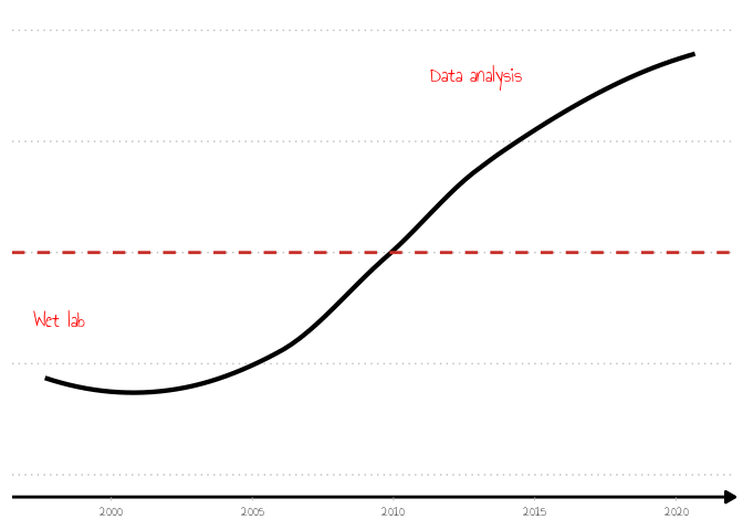
The data science trajectory line is a smooth line, result of a linear model fitted to the time points in the CV. The model was chosen based on the very accurate statistical measure of “being easy on the eye” - smooth and in an upward trajectory after a particular time point.
To add the small icons, I ended up using magick (via cowplot) which
I could only install with conda (well,
mamba), due to missing
dependencies. I did try the R way with install.packages("magick") but
gave up after the second error. Life is too short.
The icons themselves were downloaded from the Noun Project which has tons of free to use icons (with attribution). I ended up paying for these because I liked them so much, but nevertheless I will credit the author, Tippawan Sookruay.
As these images will be included in several versions of the plot, I wrapped the code in a function to save typing:
add_img <- function(gg){
  ggdraw(gg) +
  draw_image("/home/adomingu/Documents/personal/CV/visual_cv/figure/noun_pipette_3384602.svg.png", scale = 0.1, x = 0.09, y = 0.001, hjust = 0.52, vjust = 0.25) +
  draw_image("/home/adomingu/Documents/personal/CV/visual_cv/figure/noun_chart_3384933.svg.png", scale = 0.1, x = 0.4, y = 0.25)
}

p_save <- add_img(p)

ggsave("../assets/img/timeline_icons.png", p_save, dpi = 600, width = 10, height = 6, units = "cm")
![]()
So now the plots has the basics:
- A timeline on the x-axis
- rough % of data analysis as part of my job
- and a couple of cool looking icons to show how it all started and it is going
In technical terms, the most difficult part was to add the icons, and in
particular placing them in the right location. Not only did it take a
lot of trial an error, it was only just right once saved as a file
(pdf). I wanted to have a wide plot to fit with the slides, and the
plotting window is square, so some eye-balling was required. I tried a
few other packages (patchwork for example), but in the end magick +
cowplot was the best option for my purposes.
But we are not done yet: career milestones and cities I lived in are still missing.
Publications
Until now I have worked in fairly academic milieu where one’s achievements are measured mostly by publications. whilst I don’t particularly agree with this[4], it is a decent proxy for output which is what I was looking to represent. Other fields will have their own metrics of productivity (number of sales, features shipped, etc).
For full reproducibility, I tried to get my publications list from pubmed or ORCID but ran into problems. The issue with pubmed queries is that my name follows Portuguese naming conventions, and each publisher seems to ignore what I write in the provided forms and makes up a different version of my name. Not helping matters is that my first and last names are fairly common, so there were a lot of false positives in the pubmed queries. I could retrieve some of the variables I needed from ORCID but publications dates were missing for some paper.
Luckily I keep all my publications in a bibtex file exported from
zotero and ended up resorting to that. The publication data was
extracted with the help of bib2df to read in the bibtex file, and
rcrossref to retrieve publications dates which were incomplete or
missing in the bibtex file.
# ==========================================================================
# Get publication list
# ==========================================================================
path <- "/home/adomingu/Documents/personal/CV/Awesome-CV/examples/resume/AD_papers.bib"

df <- bib2df(path)
setDT(df)
my_dois <- df[!is.na(DOI)]$DOI

# my_dois <- rorcid::identifiers(rorcid::works("0000-0002-1803-1863"))
pubs <- rcrossref::cr_works(dois = my_dois)$data %>%
  setDT() %>%
  .[, c("title", "type", "container.title", "published.print", "published.online", "deposited")] %>%
  .[, Date := ifelse(!is.na(published.print), published.print, published.online)] %>%
  .[, Date := ifelse(!is.na(Date), Date, deposited)] %>%
  .[, Date := ifelse(nchar(Date) == 4, paste(Date, "03-01", sep = "-"), Date)] %>%
  .[, Date := ifelse(nchar(Date) == 7, paste(Date, "01", sep = "-"), Date)] %>%
  .[, Date := as.IDate(Date)]

pubs %>%
  head() %>%
  knitr::kable()
| title | type | container.title | published.print | published.online | deposited | Date |
|---|---|---|---|---|---|---|
| Condensation of Ded1p Promotes a Translational Switch from Housekeeping to Stress Protein Production | journal-article | Cell | 2020-05 | NA | 2020-05-14 | 2020-05-01 |
| The IDR-containing protein PID-2 affects Z granules and is required for piRNA-induced silencing in the embryo | posted-content | NA | NA | NA | 2020-04-18 | 2020-04-18 |
| Extensive nuclear gyration and pervasive non-genic transcription during primordial germ cell development in zebrafish | posted-content | NA | NA | NA | 2020-01-13 | 2020-01-13 |
| Glia as transmitter sources and sensors in health and disease | journal-article | Neurochemistry International | 2010-11 | NA | 2019-05-28 | 2010-11-01 |
| FK506 prevents mitochondrial-dependent apoptotic cell death induced by 3-nitropropionic acid in rat primary cortical cultures | journal-article | Neurobiology of Disease | 2004-12 | NA | 2019-02-03 | 2004-12-01 |
| White matter synapses: Form, function, and dysfunction | journal-article | Neurology | 2011-01-25 | 2011-01-24 | 2018-02-09 | 2011-01-25 |
Once that was done, I could proceed to add the publications has milestones in the plot - one point per paper.
Not so fast.
Turns out that when that smooth line was created, a linear model fit on the original time points, I lost the reference points, ratio of data analysis, on the y-axis. So now I also need to estimate the Y positions in the plot.
ggplot hacking
I have done enough custom plots, and spent enough hours googling how to
do it, to know that ggplot objects store a ton of information which
can be accessed and modified (at your own risk). So what I did was to
extract the x and y coordinates of the fitted line from the ggplot
object.
This was done in several steps:
- re-run the linear model (
spline) - plot the fitted line
- extract the coordinates from the plot
(
ggplot_build(p_smooth)$data[[1]])
#
# Retrieve the smooth line (dummy timeline) to add points of interest
# --------------------------------------------------------------------------
spline_int <- as.data.frame(spline(antonio$Date, antonio$da_ratio))

p_smooth <- ggplot(antonio, aes(x = Date, y = da_ratio)) +
  geom_smooth(method = "loess", color = "black", size = 1.5, span = 1, se = FALSE) +
  xlim(min(antonio$Date), as.IDate("2020-12-01")) +
  ylim(0, 1)

smooth_df <- ggplot_build(p_smooth)$data[[1]] %>%
  setDT() %>%
  .[, Date := as.IDate(x)] %>%
  .[]

smooth_df %>%
  head() %>%
  knitr::kable()
| x | y | flipped_aes | PANEL | group | colour | fill | size | linetype | weight | alpha | Date |
|---|---|---|---|---|---|---|---|---|---|---|---|
| 10105.00 | 0.2179275 | FALSE | 1 | -1 | black | grey60 | 1.5 | 1 | 1 | 0.4 | 1997-09-01 |
| 10211.34 | 0.2120627 | FALSE | 1 | -1 | black | grey60 | 1.5 | 1 | 1 | 0.4 | 1997-12-16 |
| 10317.68 | 0.2067649 | FALSE | 1 | -1 | black | grey60 | 1.5 | 1 | 1 | 0.4 | 1998-04-01 |
| 10424.03 | 0.2020354 | FALSE | 1 | -1 | black | grey60 | 1.5 | 1 | 1 | 0.4 | 1998-07-17 |
| 10530.37 | 0.1978752 | FALSE | 1 | -1 | black | grey60 | 1.5 | 1 | 1 | 0.4 | 1998-10-31 |
| 10636.71 | 0.1942856 | FALSE | 1 | -1 | black | grey60 | 1.5 | 1 | 1 | 0.4 | 1999-02-14 |
Now that I have the coordinates, these need to be matched with the
publication dates. However, the x-axis values (dates) of the fitted plot
are intervals which do not match the CV dates. To solve that problem, as
nearly any data manipulation problem, data.table and rolling joins
came to the rescue. The goal was to find the closest time point of my CV
in the fitted plot.
## find the closest date of publications in the dummy timeline
pubs_smooth <- smooth_df[pubs, roll = "nearest", on = "Date"] %>%
  .[, new_date := as.IDate(x)] %>%
  .[, Date:= NULL] %>%
  setnames("new_date", "Date") %>%
  .[, c("Date", "y", "title")] %>%
  .[Date <= as.IDate("2012-01-01"), Publications := "Experimental"] %>%
  .[Date >= as.IDate("2012-01-01"), Publications := "Analyst"] %>%
  .[, Publications := ifelse(str_detect(title, "NXF1"), "Both", Publications)] %>%
  .[]

pubs_smooth %>%
  head() %>%
  knitr::kable()
| Date | y | title | Publications |
|---|---|---|---|
| 2020-05-17 | 0.9417646 | Condensation of Ded1p Promotes a Translational Switch from Housekeeping to Stress Protein Production | Analyst |
| 2020-05-17 | 0.9417646 | The IDR-containing protein PID-2 affects Z granules and is required for piRNA-induced silencing in the embryo | Analyst |
| 2020-02-01 | 0.9358999 | Extensive nuclear gyration and pervasive non-genic transcription during primordial germ cell development in zebrafish | Analyst |
| 2010-10-08 | 0.5528694 | Glia as transmitter sources and sensors in health and disease | Experimental |
| 2004-12-11 | 0.2448564 | FK506 prevents mitochondrial-dependent apoptotic cell death induced by 3-nitropropionic acid in rat primary cortical cultures | Experimental |
| 2011-01-22 | 0.5719478 | White matter synapses: Form, function, and dysfunction | Experimental |
Some of that information is not necessary but I kept it anyway to show how it looks.
A similar join was done for some key outreach dates that will also be highlighted in the final plot.
## same for outreach activities
outreach <- antonio[Role == "Outreach" & Timpepoint == "Start"]

outreach_smooth <- smooth_df[outreach, roll = "nearest", on = "Date"] %>%
  .[, new_date := as.IDate(x)] %>%
  .[, Date:= NULL] %>%
  setnames("new_date", "Date") %>%
  .[, c("Date", "y", "Type")] %>%
  .[]
Annotate with academic degrees
I could have used points (geom_point) with different color/shape to
highlight my academic degrees, but these belong to a different category
of events than publications or other more technical milestones /
achievements, and would add too much information to the lines anyway. As
an alternative I decided to use arrows and text to indicate when those
degrees where obtained.
Again there is nothing magic or novel about this, in fact I took
inspiration from Cedric
Scherer, except the
need for trial and error to get the locations correct. The positions of
the arrows were put on a tibble to make it easier to plot later on:
#
# plot annotations - academic points of interest
# --------------------------------------------------------------------------
arrows <- tibble(
    x1 = c(as.IDate("2000-09-01"), as.IDate("2004-12-01"), as.IDate("2010-09-01")),
    x2 = c(as.IDate("2001-09-01"), as.IDate("2005-05-01"), as.IDate("2009-08-01")),
    y1 = c(0.08, 0.15, 0.35),
    y2 = c(0.13, 0.20, 0.40)
  )
arrows
## # A tibble: 3 x 4
##   x1         x2            y1    y2
##   <date>     <date>     <dbl> <dbl>
## 1 2000-09-01 2001-09-01  0.08  0.13
## 2 2004-12-01 2005-05-01  0.15  0.2
## 3 2010-09-01 2009-08-01  0.35  0.4
Remember that in the plots show in the X-window, the arrows, text
annotations, and icons where not in the correct locations. I kept saving
the plots with the final dimensions to see if everything is in it’s
right place. Saving as pdf gave me the best results vs saving as png.
This is the same reason why I am saving the plots and linking to them in
the Rmd rather than letting rmarkdown do all the work for me.
This is the final version:
p_complete <- p +
  geom_jitter(data = pubs_smooth %>% arrange(Publications), aes(x = Date, y = y, fill = Publications), size = 2, alpha = 0.8, stroke = 1, shape=21) +
  geom_point(data = outreach_smooth, aes(x = Date, y = y), fill = "#e37e00", size = 2, alpha = 0.7, stroke = 1, shape=23) +
  scale_colour_stata() +
  scale_fill_stata() +
  guides(
    fill = guide_legend(reverse=TRUE)
  ) +
  labs(
    fill = "Publications:"
  ) +
  annotate(
    "text", x = as.IDate("1999-09-01"), y = 0.08, color = "gray20", lineheight = .9,
    label = "BSc", size = 4, family = "Annie Use Your Telescope") +
  annotate(
    "text", x = as.IDate("2004-11-01"), y = 0.12, color = "gray20", lineheight = .9,
    label = "MSc", size = 4, family = "Annie Use Your Telescope") +
  annotate(
    "text", x = as.IDate("2010-10-01"), y = 0.3, color = "gray20", lineheight = .9,
    label = "PhD", size = 4, family = "Annie Use Your Telescope") +
  geom_curve(
    data = arrows, aes(x = x1, y = y1, xend = x2, yend = y2),
    arrow = arrow(length = unit(0.07, "inch")), size = 0.4,
    color = "gray20", curvature = 0.3
  ) +
  theme(
    legend.direction = "horizontal",
    legend.position = c(1, 0.05),
    legend.justification = c(1, 0))

p_save <- add_img(p_complete)
ggsave("../assets/img/timeline_complete.png", p_save, dpi = 300, width = 10, height = 6, units = "cm")
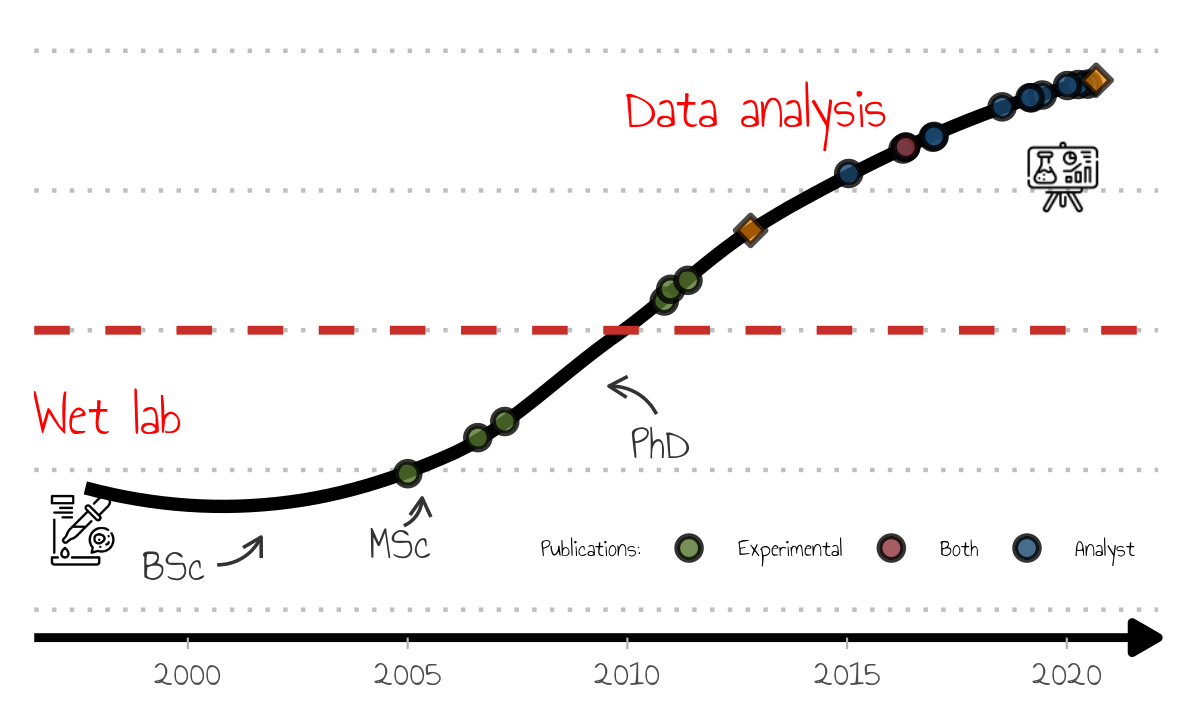
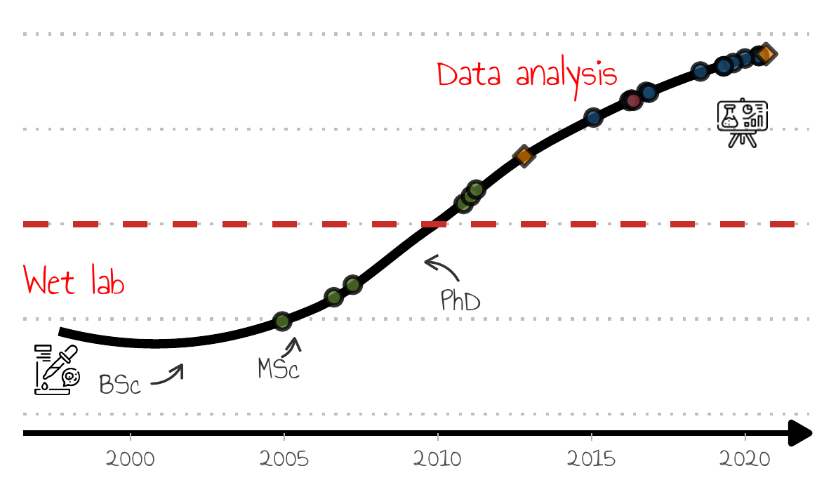
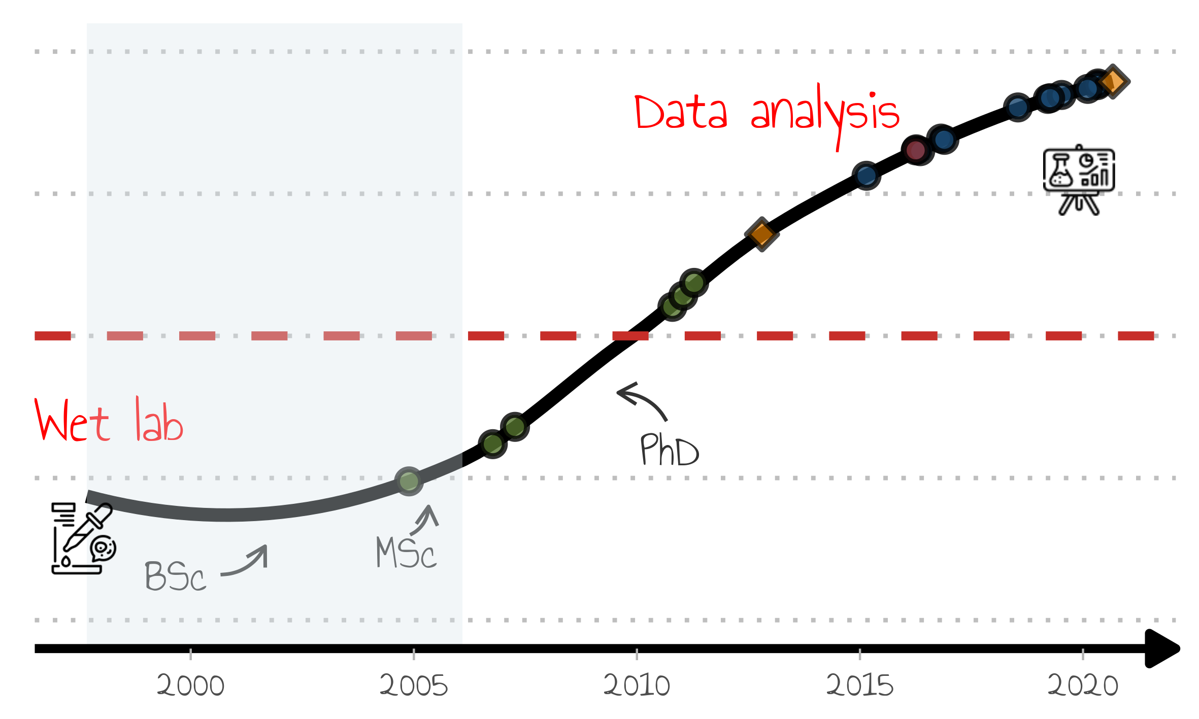
What is the information contained in the figure:
- icons depicting a start as a bench scientist and the current status as a data analyst
- a line showing a smooth upward trajectory towards data science, but
- data science only took over bench work (red line) at some point after my PhD
- milestones (papers) are also depicted as round points, and in keeping with my trajectory, there are some to which I contributed only lab work, others with data analysis (one with both!).
- the milestones, the diamond shaped points, are to be described in the presentation (blog, R package maintainer).
I hope you can appreciate that this plot contains a lot of information, but doesn’t feel cluttered. Importantly, this is not meant to be a self-contained, self-explanatory piece of data visualization as I will be guiding the audience through the pieces of information and revealing them only when needed.
Getting there
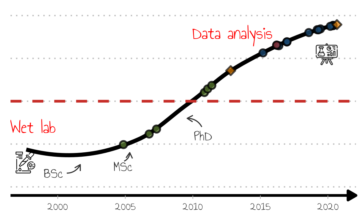
Well, nearly done. There are still a couple of modifications to be done for the presentation:
- No legend because I wanted to talk about the milestones during the presentation without giving way what the points meant too early;
- Indication of the places of work is still missing.
The latter is crucial to the presentation because I will be highlighting each place of work, and follow that up with slides describing my role, tasks, and accomplishments. So in effect highlighting the places of work in a stepwise manner is critical to create breaks and setting the tone for each part of the presentation.
Removing the legend is fairly simple (said he after googling how to do for the 1000th time).
## no legend
p_no_leg <- p_complete +
  guides(
    fill = "none"
  )
p_save <- add_img(p_no_leg)
ggsave("../assets/img/timeline_no_legend.png", p_save, dpi = 300, width = 10, height = 6, units = "cm")
To show how I moved around I made used of geom_annotation and shaded
boxes to highlight each job, one at the time. Each one of these was then
shown as bridge between parts of the talk.
For simplicity I am plotting only one here:
## add countries

p_no_leg <- p_complete +
  guides(
    fill = "none"
  )
add_img(p_no_leg)
# ggsave("timeline_no_legend.pdf", dpi = 600, width = 10, height = 6, units = "cm")

p_pt <- p_no_leg +
  annotate("rect",
    xmin = min(antonio$Date), xmax = as.Date("2006-02-01"),
    ymin = -Inf, ymax = Inf,  fill = "#d9e6eb", alpha=0.35)
p_save <- add_img(p_pt)

ggsave("../assets/img/timeline_no_legend.pt.png", p_save, dpi = 600, width = 10, height = 6, units = "cm")
Final word
And that was it. It took me quite some time to get it done, including testing packages which were not used, but in the end I am quite happy with the result. It was a lot of work, but I wanted to impress and I did.
Footnotes
[1] Before any presentation I always think about who my audience will be and what is the goal. Only then do I start sketching the slides with pen and paper to organize the ideas into slides. One key message per slide.
[2] For example https://github.com/laresbernardo/lares and https://github.com/daattali/timevis.
[3] It’s fine to use the publication record, but someone career should not be just about that. There’s also teaching, mentoring, outreach, software, etc, which I am not sure it’s always taken into account when evaluating academics. Not that it affects me because I am not looking to climb the academic ladder.
[4] The slide-deck is not available, but if a few people show interest I could put it online.