How big is my baby?
updated on 2017-08-28 to include 1 year measurements
So I am a bit of a nerd and also a recent progenitor. So of course I had to find ways of analyzing the growth of my F1. What follows is a very brief look into the growth pattern of Em, using the little data I have so far - F1 is now 1 year old.
The data
Initially the data was input manually, in wide format, and then converted to a tidier long format, but in the end I decided to write it in a file, already in long format, because it is easier to read and update. It also makes more sense that way because there aren’t values for every time point for every variable. For instance, the circumference of the head is only measured when Em visits the Doctor. Nevertheless I am leaving the original code here for reference.
Another thing to keep in mind is that both the days and the measurements are estimates - some were taken at home using a bathroom scale or in changing station with a ruler. I expect that over time the will be ironed out. Also, this is just a bit of fun.
em <- data.frame(
  # code = factor(c("U1", "U2", "U3", "U4", "U5")),
  Week = c(0, 1, 4, 16, 28),
  Weight = c(3.450, 3.280, 3.750, 5.050, 7.250),
  Height =c(53, 52, 55, 61, 66.5),
  Head_circumference = c(35.5, 35, 36, 40.5, 43.5)
)
em

em_tidy <- em %>%
  mutate(Day = Week * 7) %>%
  select(-c(Week)) %>%
  gather(Measurement, Value, c( Weight, Height, Head_circumference)) %>%
  mutate(Person = "Em")
The units are not in the table but are cm for height and head circumference, and kg for weight.
em_tidy <- read.delim("data/em_data.txt.csv")
glimpse(em_tidy)
## Observations: 22
## Variables: 4
## $ Person      <fctr> Em, Em, Em, Em, Em, Em, Em, Em, Em, Em, Em, Em, E...
## $ Day         <int> 0, 0, 0, 3, 3, 3, 29, 29, 29, 87, 87, 87, 170, 170...
## $ Measurement <fctr> Weight, Height, Head_circumference, Weight, Heigh...
## $ Value       <dbl> 3.45, 53.00, 35.50, 3.28, 52.00, 35.00, 3.75, 55.0...
Exploratory plot
The first thing to do is to plot all the things!
ggplot(em_tidy, aes(x=Day, y=Value)) +
  geom_point() +
  facet_grid(Measurement ~ ., scales = "free_y") +
  theme_Publication() +
  scale_colour_Publication()
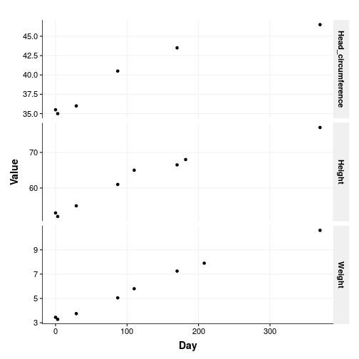
Well, Em is growing so that is nice. The plot is a bit clunky though: there are no units and it is not easy to read. One of those situations when facets are not ideal. Let’s change that.
p1 <- ggplot(subset(em_tidy, Measurement == "Weight"), aes(x=Day, y=Value)) +
  geom_point() +
  theme_Publication() +
  scale_colour_Publication() +
  xlab("") +
  ylab("Weight (kg)")

p2 <- ggplot(subset(em_tidy, Measurement == "Height"), aes(x=Day, y=Value)) +
  geom_point() +
  theme_Publication() +
  scale_colour_Publication() +
  xlab("") +
  ylab("Height (cm)")

p3 <- ggplot(subset(em_tidy, Measurement == "Head_circumference"), aes(x=Day, y=Value)) +
  geom_point() +
  theme_Publication() +
  scale_colour_Publication() +
  xlab("Age (Days)") +
  ylab("Head circumference (cm)")

multiplot(plotlist=list(p1, p2, p3))
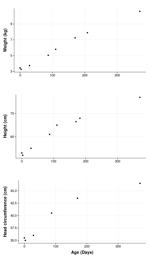
So yes, there is some growing happening but also a dip around the first week when Em lost nearly 200 g. Turns out this is completely normal and as expected at the next visit the weight was back up again.
Looking at her numbers alone feel a little bland, and as I keep hearing in more or less to understand how big a number really is, one needs to compare it to something.
General Population data
Enter the data for the general population. This data as been compiled by the World Health organization for quite some time now, and serves as basis for pediatricians around the world, to compare baby growth to what is expected. Luckily for me all of this data has been assembled in a neat package: The healthy growth package. Check also the tutorial.
options(repos = c(
  CRAN = "http://cran.rstudio.com/",
  deltarho = "http://packages.deltarho.org"))
install.packages("hbgd")
It not only contains data, but also some practical functions (and visualizations) to extract said data. For instance one can get the median height of Female babies (the default) for any range of ages, let’s say for the first year:
library("hbgd")
x <- seq(0, 365, by = 7)
x
##  [1]   0   7  14  21  28  35  42  49  56  63  70  77  84  91  98 105 112
## [18] 119 126 133 140 147 154 161 168 175 182 189 196 203 210 217 224 231
## [35] 238 245 252 259 266 273 280 287 294 301 308 315 322 329 336 343 350
## [52] 357 364
med <- who_centile2htcm(x)
med
##  [1] 49.1477 50.3298 51.5120 52.4695 53.3809 54.2454 55.0642 55.8406
##  [9] 56.5767 57.2761 57.9436 58.5816 59.1922 59.7773 60.3393 60.8795
## [17] 61.3991 61.8988 62.3795 62.8423 63.2884 63.7196 64.1370 64.5422
## [25] 64.9366 65.3214 65.6978 66.0668 66.4290 66.7850 67.1355 67.4810
## [33] 67.8219 68.1585 68.4911 68.8200 69.1452 69.4672 69.7858 70.1015
## [41] 70.4142 70.7241 71.0314 71.3359 71.6378 71.9372 72.2340 72.5284
## [49] 72.8203 73.1099 73.3971 73.6820 73.9647
With this I can now compare my offspring with what is expected in the population:
age <- unique(em_tidy$Day)

per_who <- data.frame(
    Day = age,
    Weight = who_centile2wtkg(age),
    Height = who_centile2htcm(age),
    Head_circumference = who_centile2hcircm(age)
  ) %>%
  gather(
    Measurement,
    Value,
    c( Weight, Height, Head_circumference)) %>%
  mutate(Person = "WHO") %>%
  rbind(em_tidy)

glimpse(per_who)
## Observations: 49
## Variables: 4
## $ Day         <int> 0, 3, 29, 87, 170, 182, 110, 208, 370, 0, 3, 29, 8...
## $ Measurement <chr> "Weight", "Weight", "Weight", "Weight", "Weight", ...
## $ Value       <dbl> 3.2322, 3.2315, 4.1353, 5.7539, 7.1393, 7.2894, 6....
## $ Person      <chr> "WHO", "WHO", "WHO", "WHO", "WHO", "WHO", "WHO", "...
p1 <- ggplot(subset(per_who, Measurement == "Weight"), aes(x=Day, y=Value, color=Person)) +
  geom_point(group="Person") +
  geom_line() +
  theme_Publication() +
  scale_colour_Publication() +
  xlab("") +
  ylab("Weight (kg)")

p2 <- ggplot(subset(per_who, Measurement == "Height"), aes(x=Day, y=Value, color=Person)) +
  geom_point(group="Person") +
  geom_line() +
  theme_Publication() +
  scale_colour_Publication() +
  xlab("") +
  ylab("Height (cm)")

p3 <- ggplot(subset(per_who, Measurement == "Head_circumference"), aes(x=Day, y=Value, color=Person)) +
  geom_point(group="Person") +
  geom_line() +
  theme_Publication() +
  scale_colour_Publication() +
  xlab("Age since birth (Days)") +
  ylab("Head circumference (cm)")

multiplot(plotlist=list(p1, p2, p3))
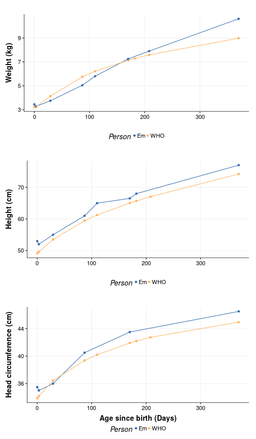
Yeah, we really screwed up with that one measurement. On the other hand, Em appears to be as average as an F1 can get. But we can test that as well. Suppose we want to know the WHO centile of a female child at Em age (370) who is 77 cm tall:
current_age <- max(em_tidy$Day)
current_weight <- max(subset(em_tidy, Measurement == "Weight")$Value)
weight_age <- max(subset(em_tidy, Measurement == "Weight")$Day)
current_height <- max(subset(em_tidy, Measurement == "Height")$Value)
height_age <- max(subset(em_tidy, Measurement == "Height")$Day)

per_h <- who_htcm2centile(agedays = height_age, htcm = current_height)
per_w <- who_wtkg2centile(agedays = weight_age, wtkg = current_weight)
It seems like she is in the 86.0287518 percentile for height and in the 90.7631171 percentile for weight, which makes sense - Slender was the word used by the doctor to describe Em.
We can also see that in when plotting the percentile bands, again using the nifty function of hbgd, to visualize this:
WHO bands at centiles 1, 5, 25, 50, 75, 95, 99
p1 <- ggplot(subset(em_tidy, Measurement == "Weight"), aes(x=Day, y=Value, color=Person)) +
  geom_point(group="Person") +
  xlim(0, current_age) +
  geom_who(x_seq = seq(0, (current_age) , by = 10), y_var = "wtkg") +
  theme_Publication() +
  scale_colour_Publication() +
  xlab("") +
  ylab("Weight (kg)")

p2 <- ggplot(subset(em_tidy, Measurement == "Height"), aes(x=Day, y=Value, color=Person)) +
  geom_point(group="Person") +
  geom_who(x_seq = seq(0, (current_age) , by = 10), y_var = "htcm") +
  theme_Publication() +
  scale_colour_Publication() +
  xlab("") +
  ylab("Height (cm)")

multiplot(plotlist=list(p1, p2))
Take home messages:
- F1 started as a very average baby but is now growing into a big toddler.
- F0 is pretty poor at taking measurements